Research :
Color Theory: Introduction
Colour
theory is a system of rules and guidance for mixing various colours in orders to
create aesthetically pleasing blends, produce maximum readability and clarity
and draw on cultural associations to effect. About colour theory is more
different perspective of the respective authors might be confusing instead of
adding to a better understanding. With the colours everyone can set a mood,
attract attention, or make a statement. Anyone can use colour to energise or to
cool down. Besides that, selecting the right colour scheme, can create an
ambiance of elegance, warmth or tranquility or you can convey an image of playful
youthfulness. And also the colour can be your most powerful design element if you
learn to use it effectively.
Why study colour theory?
If
creation or design of visual documents, an understanding of colour will help
when incorporating it into the own designs. Choices regarding colour often seem
rather mystical, many people seem to base decisions on nothing other than
"it looks right." Although often told I had an eye for colour, the
reason why some colours worked together while others did not always intrigued me
and I found the study of colour theory fascinating. During I studies, I learned
that there were 2 main reasons why scholars investigated colour—the first
involved the communication of colours; the other involved the application of
colour.
Colour Basic
Colour
is the perceptual characteristic of light described by a colour name.
Specifically, colour is light, and he light of many colours that we see is the
colour of the visible spectrum: red, orange, yellow, green, blue, and purple.
Objects absorb certain wavelengths and reflect others back to the viewer. We
perceive these wavelengths as colour.
Hue
Hue
is the most basic of colour terms and basically denotes an object’s colour. When
said “blue,” “green” or “red,” we’re talking about hue.
Color Wheel


First
circular colour diagram was designed by Sir Isaac Newton in 1666.
The
colour wheel or colour circle is the basic tool for combining colours.
The
colour wheel is designed so that virtually any colours pick from look good
together. Over the years, many variations of the basic design have been made,
but the most common version is a wheel of 12 colours based on the RYB (or
artistic) colour model.
Traditionally,
there are a number of colour combinations that are considered especially
pleasing. These are called colour harmonies or colour chords and they consist of
two or more colours with a fixed relation in the colour wheel.
Colour
Impact is designed to dynamically create a colour wheel to match your base
colour.
Color Terminology

Primary Colours: Colours at their basic essence; those
colours that cannot be created by mixing others (red, yellow and blue).

Secondary Colours: Those colours achieved by a mixture of two
primaries (green, orange and purple).

Tertiary Colours: Those colours achieved by a mixture of
primary and secondary hues.

Complementary colours - red and green Complementary Colours:
Those colours located opposite each other on a colour wheel.

Analogous Colours: Those colours located close together on a
colour wheel.
Active @ Passive Colours
The
colour wheel can be divided into ranges that are visually active or passive.
Active colours will appear to advance when placed against passive hues. Passive
colours appear to recede when positioned against active hues.
-
Advancing hues are most often thought to have less visual weight than the
receding hues.
-
Most often warm, saturated, light value hues are "active" and
visually advance.
-
Cool, low saturated, dark value hues are "passive" and visually
recede.
-
Tints or hues with a low saturation appear lighter than shades or highly
saturated colors.
-
Some colors remain visually neutral or indifferent.
Warm and cool colors

The
color circle can be divided into warm and cool colors.
Warm colors are vivid and energetic, and tend to
advance in space.
Cool colors give an impression of calm, and create a
soothing impression.
White,
black and gray are considered to be neutral.
Color Harmonies
Basic
techniques for combining colours
Below
are shown the basic colour chords based on the colour wheel:
1. Complementary


Colours
that are opposite each other on the colour wheel are considered to be
complementary colours (For example: red and green).
The
high contrast of complementary colours creates a vibrant look especially when
used at full saturation. This colour scheme must be managed well so it is not
jarring.
Complementary
colours are tricky to use in large doses, but work well something
to stand out.
Complementary
colors are really bad for text.
2. Analogous
.gif)

Analogous
colour schemes use colours that are next to each other on the colour wheel. It is usually match well and create serene and comfortable designs.
Analogous
colour schemes are often found in nature and are harmonious and pleasing to the
eye.
Make
sure have enough contrast when choosing an analogous colour scheme.
Choose
one color to dominate, a second to support. The third color is used (along with
black, white or gray) as an accent.
3. Triad


A
triadic colour scheme uses colours that are evenly spaced around the colour wheel.
Triadic
colour harmonies tend to be quite vibrant, even people use pale or unsaturated
versions of hues.
To
use a triadic harmony successfully, the colors should be carefully balanced -
let one color dominant and use the two others for accent.
4. Split-Complementary


The
split-complementary colour scheme is a variation of the complementary colour
scheme. In addition to the base colour, it uses the two colours adjacent to its
complement.
This
colour scheme has the same strong visual contrast as the complementary colour
scheme, but has less tension.
The
split-complimentary colour scheme is often a good choice for beginners, because
it is difficult to mess up.
5. Rectangle (tetrad)


The
rectangle or tetrad colour scheme uses four colours arranged into two
complementary pairs.
This
rich colour scheme offers plenty of possibilities for variation.
The tetrad colour scheme works best if people let one colour be dominant.
People should also pay attention to the balance between warm and cool colours in design.
6. Square


The
square colour scheme is similar to the rectangle, but with all four colours
spaced evenly around the colour circle.
The
square colour scheme works best if people let one colour be dominant.
this also have pay attention to the balance between warm and cool colours in design.
Example :


Task 1:
Research : Investigate the statement in colour psychology by Carl Jung
1. Light and colour
can influence how people perceive the area around them. Different light sources
affect how the colours of walls and other objects are seen.
- This is what i experiment the first statement. I had choose two different source of light, that is nature light and bulb light. Let's see how the situation colour of wall changes under different light sources below :

Figure 1: Nature light
- The colour of the wall is like normal colour white and a bit darkness, from the nature light sometimes will changing because of different moods from sunlight.

Figure 2 : Light Bulb on wall
- From bulb light the colour of wall will appear to be yellowish and a bit brown colour.
2. Specific hues of
colours seen under natural sunlight may vary when seen under the light from an
incandescent (tungsten) light bulb: lighter colours may appear to be more orange
or "brownish" and darker colours may appear even darker.
- Figure 4,6,8,10 (Bulb light) also try to experiment of different colours from Bulb light will appear more darker.

Figure 3 : Nature light

Figure 4: Bulb Light

Figure 5 : Nature light

Figure 6: Bulb Light

Figure 7 : Nature light

Figure 8: Bulb Light

Figure 9 : Nature light

Figure 10 : Bulb Light
3. Light and the
colour of an object can affect how one perceives it’s positioning. If light or
shadow, or the colour of the object, masks an object's true contour (outline of
a figure) it can appear to be shaped differently from reality.


Figure 9 : Sun Light (First light)
- This is what i experiment from sun light. When i taken the 3d things used in front and back of the sun light situation. In front of sunlight appear darker, from the back sun light can see that the things more clearly. This is what the affect.


Figure 10 : Bulb Light (Second light)
- This is what i experiment Two type of light source and see how's the two different light and can see the shape. First light is sun light(Figure 9) and the second light is Bulb light (Figure 10). So, this is what i experiment the second light. When i taken by using bulb light front and back of the bulb light situation. the spectacles In front of bulb light appear more darker in night, from the back bulb light can see that the spectacles look more clearly.
4. Objects under a
uniform light-source will promote better impression of three-dimensional shape.

Figure 11 : Nature Light

Figure 12 : Long Tube bulb light

Figure 13 : Nature Light

Figure 14 : Long Tube bulb light
5. The colour of an
object may affect whether or not it seems to be in motion.
An illusion is something that isn't real. It may look real, but it's actually fake. It is just a crafty construction or fantasy this is what i play around with the optical illusion and colour to make it like it's motion look. This few designed this is what i done my experiment with different mixed colour together, and keep play around with the rotate make it like creative and unique motion look.
An illusion is something that isn't real. It may look real, but it's actually fake. It is just a crafty construction or fantasy this is what i play around with the optical illusion and colour to make it like it's motion look. This few designed this is what i done my experiment with different mixed colour together, and keep play around with the rotate make it like creative and unique motion look.

Figure 15

Figure 16

Figure 17

Figure 18

Figure 19

Figure 20

Figure 21

Figure 22
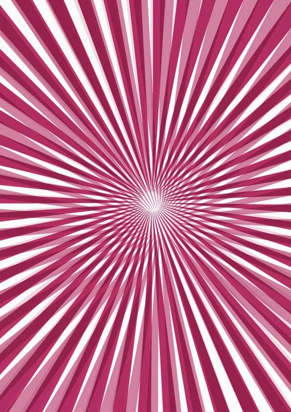
Figure 23

Figure 24

Figure 25

Figure 26

Figure 27

Figure 28

Figure 29
For this task have to create one Theme and then explain it why choose this Theme. Finalized i choose one theme called "Fruit rainbow".
Besides that, i have to prepare what kind of fruit have to shoot and one day i went to NSK supermarket shoot kind of different fruit, there have a lot kind of fruit which is watermelon, pineapple, dragon fruit, banana, orange, apple, mango, durian, rose apple, green and purple grape, starfruit strawberry and so on. There got a lot of different kind of fruit especially apple which is green apple, light green apple, red apple and big apple. NSK supermarket is quite famous and suitable to choose and shoot kind of different of fruit. After that i shoot one by one and used Ai illustrator to combine and make it Fruit rainbow. Some of fruit cant shoot inside the fruit so i decide buy the fruit go back and shoot for example like Kiwi got yellow and green, rambutan, lychee, durian actually there stuff to help customer to open, so i got chance to shoot from there, lychee, rambutan and pineapple i buy from outside mini shop selling RM1 fruit.
Why i choose Fruit Rainbow?
Fruit rainbow have a lot of different colour. Colour can represent people to express emotion and mood feeling, so i used Fruit colour to represent person to express emotion and mood. For example if someone eat Red apple can represent that person was happy, love, powerful and so on. Every colour had different meaning, so each colour can represent people to express emotion feeling.
Process
NSK supermarket


Ai illustrator
- Design layout


No comments:
Post a Comment